Nobody is sitting at a desk
Most interfaces assume a seated user with two hands, good light, a connection and full literacy. On a construction site or a farm every one of those breaks. Six assumptions worth checking, and what each one changes about the layout.
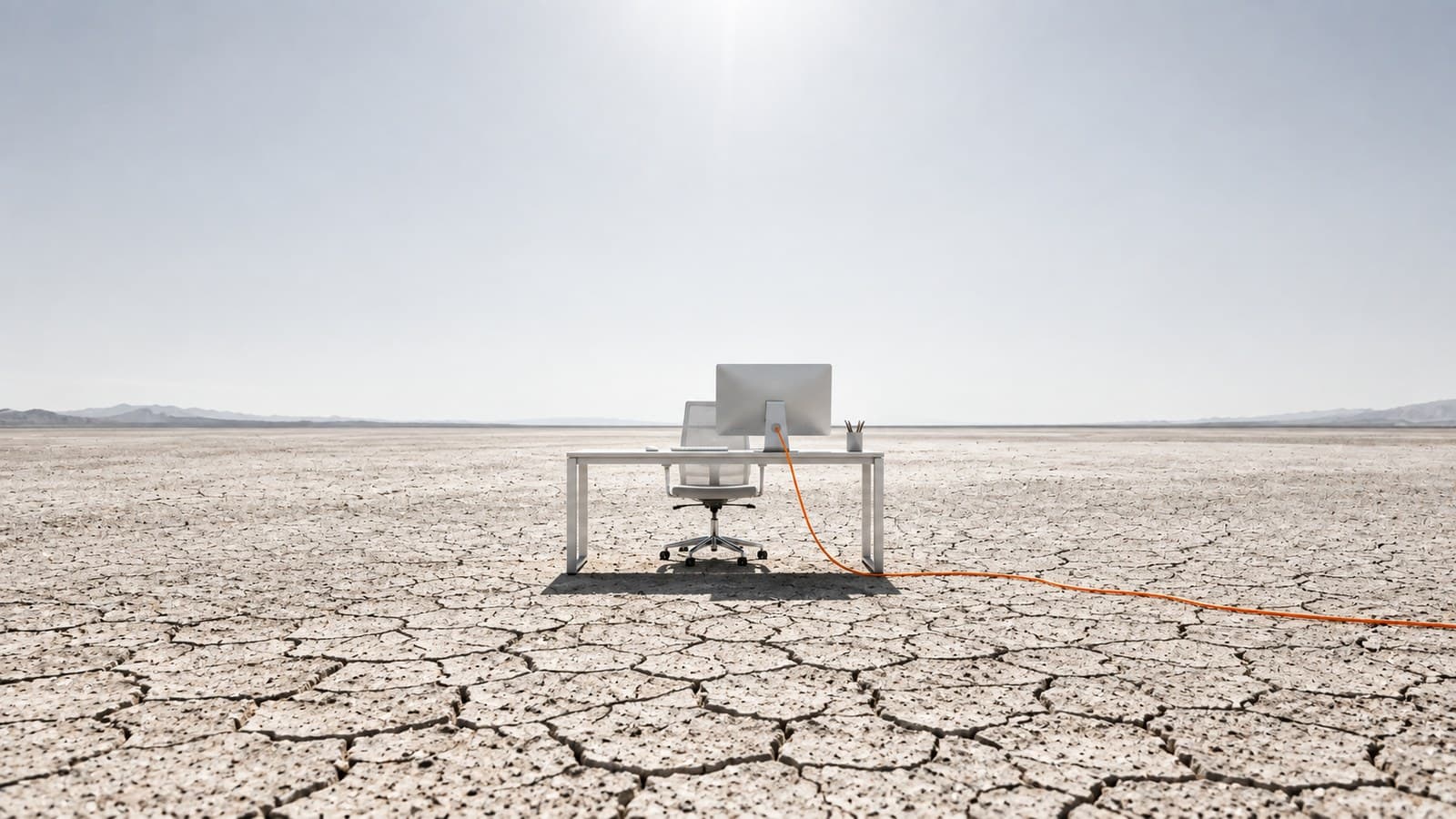
Open any design system and read the assumptions it never states. The person is sitting. They have two free hands. The screen is in reasonable light. There is a network. They can read the language fluently. They will finish what they started before something interrupts them.
That description fits an office. It does not fit a construction site, a field, a warehouse, a delivery route or a hospital ward, and a great deal of valuable software is used in exactly those places.
I have spent most of the last few years designing for the second group: a construction management platform used by people on site, and a farming app used by people standing in a field. Here is what actually breaks, in the order it tends to bite.
The screen is in the sun
This is the one people treat as a visual preference and it is not. It is legibility or nothing.
Outdoors, a mid grey on white that looks refined indoors becomes invisible. So does a thin weight at a small size, and so does most of the soft, low-contrast styling that reads as premium on a desk.
What it changes: the primary action, the current status, and any number somebody is going to act on all move to the highest contrast pairing available, and stay there regardless of what the rest of the theme is doing. Decoration can be subtle. The things that carry meaning cannot.
One hand is already busy
The other hand is holding a tool, a crate, a railing or a child. A phone in the field is a one-handed device far more often than a phone on a sofa.
What it changes: everything in a task flow moves into the lower part of the screen, within the arc a thumb can actually reach while gripping. Controls in the top corners are for things you do once, not for the thing you do forty times an hour.
They will be interrupted
This is the assumption that costs the most, and it is invisible at a desk.
Work away from a desk is not a sequence. It is a queue that keeps getting reordered by a phone call, a person walking up, a machine that needs attention. Software written around a clean start-to-finish flow treats every one of those as an abandoned task and clears the form.
The signal is always a workaround, and it is easy to spot once you know to look. People start writing on paper first and entering it later, when the queue clears. At that point the digital system has become a slow copy of the paper one, and the cause is almost never the fields. It is that the form does not survive being put down.
What it changes: partial work has to persist as a first-class object, not a draft you hope survives. Somebody should be able to hold four half-finished things at once and finish them in any order. Design for being interrupted, not for a clean sequence, because the clean sequence does not happen.
Gloves, dust and wet hands
Touch targets that are comfortable indoors stop registering through a work glove. Screens misread wet fingers. Dust makes precise gestures unreliable.
What it changes: bigger targets than the guidelines call for, more spacing between anything destructive and anything routine, and no interaction that depends on precision. Long press, small drag handles and tightly packed rows all fail in the field before they fail anywhere else.
The network is optional
Not slow. Optional, and unpredictably so.
The common mistake is treating offline as an error state, so the interface blocks and shows a warning. That turns a normal condition into a failure the user cannot fix while standing in a field.
What it changes: work is written locally and syncs when it can. The interface never blocks on the network. It reports the queue, so somebody can see that six things are waiting and nothing is lost. Offline is a mode, not an error.
They may not read the screen at all
Literacy is a spectrum, and language is not one thing. Khetiyaar runs in Gujarati, Hindi and English, with voice guidance, because a farmer who is fluent in spoken Gujarati may not read it comfortably, and almost certainly does not read English.
What it changes, and most of it is not translation:
- Voice is a primary input, not an accessibility afterthought
- Icons carry meaning only if they were tested with the people who will use them, and many standard icons fail that test outside the context that invented them
- Layouts must survive a string getting forty percent longer, because they will
- Numbers, colour and position do work that words cannot be relied on to do
The honest version of this is that translating an English interface is not designing a multilingual one. The second is a different job and it starts earlier.
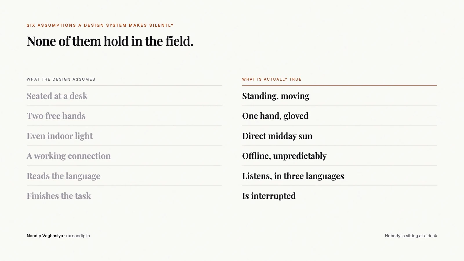
What this is really about
None of the above is exotic. It is the ordinary condition of most work that happens away from a desk, which is most work.
The reason it keeps getting missed is not ignorance. It is that design tools show you a screen at rest, in perfect light, at full size, on a machine with a connection, held by nobody. Every assumption on this page is invisible in that view, and every one of them shows up in the first hour of watching somebody actually work.
Which is the argument for going and watching. Not thoroughness for its own sake. These six constraints changed the layouts I work on more than any visual pass ever has, and not one of them was in a brief.
The farm work is written up as five field studies, and the product work is where most of these lessons ended up.