The BIM viewer's biggest problem was colour
I checked every part of a BIM viewer that plays the building schedule on a 3D model. I expected to find a missing feature. The biggest problem was colour.
- VisiLean
- UX audit, product design, design system
- 1 April 2026
- 9 min
A part of the building turns red on the screen. Is the work late? Was the part deleted? Or is it just the X axis of a section tool?
In this viewer, red meant all three. Nothing on the screen told you which one.
The product, in one minute
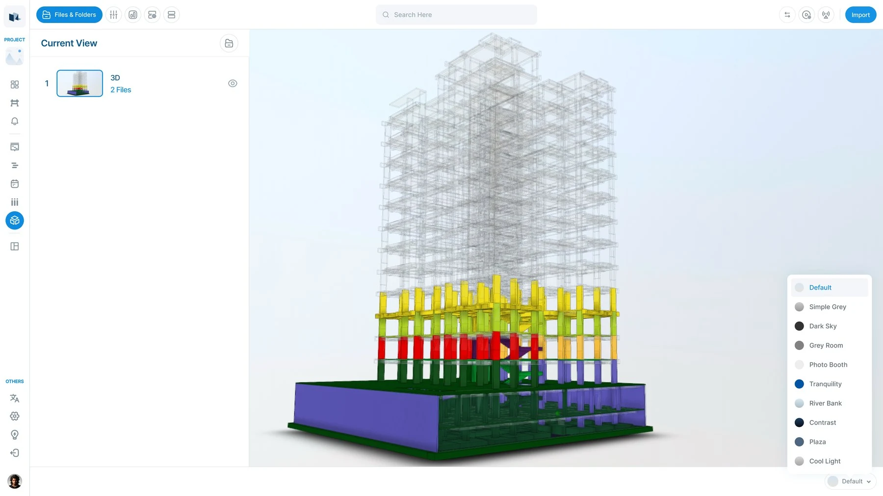
BIM Nxt is a 3D building viewer inside VisiLean. It runs in the browser. You open a building model, click any part of it, and link that part to a task in the project schedule.
Then you press play, and the schedule runs on the model. This is called 4D: 3D plus time. A Gantt chart can tell you the second floor slab is late. Here you see the slab turn red on the building, while everything around it is already green.
My job: check it all, and say what to fix first
I was not asked to design a new feature. I was asked to go through the whole module, find what is wrong, and put the problems in order.
A list of problems is easy to write. The hard part is the order. So I scored every finding with one simple rule:
How much it hurts × how often people hit it ÷ how much work it is to fix
The last part, the work to fix, is what stops an audit from turning into a wish list.
In scope: the viewer, the toolbar, the side panels, the file tree, and the five modes that colour the model, with every empty, loading and error state.
Out of scope: the 3D engine, the file converter and the schedule itself. Those are engineering decisions. An audit that ignores that line gives advice nobody can use.
Decision 1: the real problem was colour, not a missing feature
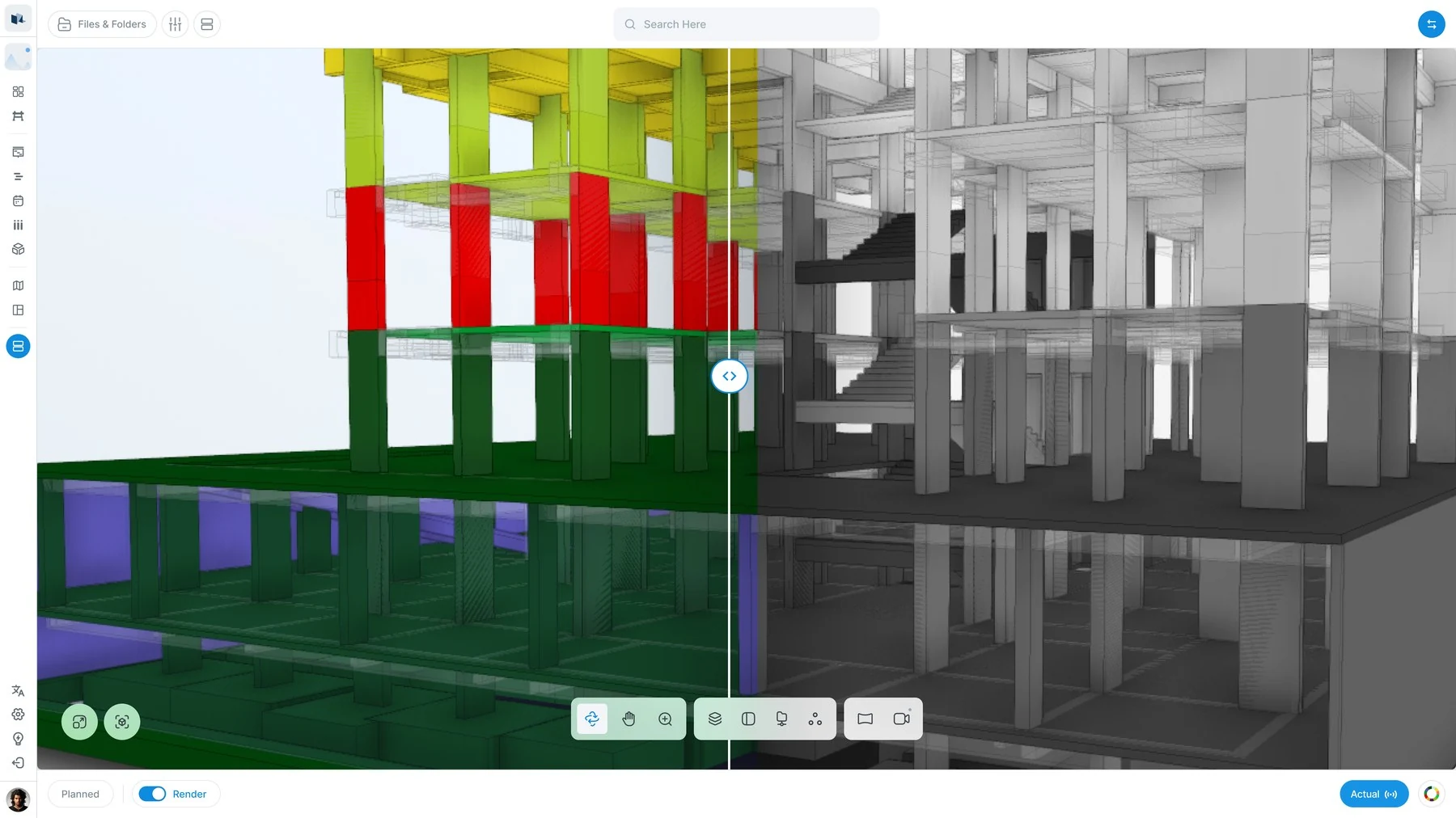
Before. I counted five different colour systems in the product. Three of them used the same three colours. Which system was active depended on a mode you could not see on the screen.
- Red meant three things: a late task, a deleted part, and the X axis.
- Two greys looked the same and meant different things.
- Parts with no data were drawn white, on a white background. White is the brightest colour in the scene. So the parts you should ignore were the ones that glowed.
| Hue | Live | 4D | Plan vs actual | Version diff | Section axes |
|---|---|---|---|---|---|
| Green4 | Completed | Completed | On track | Added | · |
| Amber3 | In progress | In progress | · | Modified | · |
| Red4 | Overdue | · | Behind | Deleted | X axis |
| Grey3 | · | Not started | Future | Unchanged | · |
| Grey1 | Open | · | · | · | · |
| Blue2 | · | · | Ahead | · | Interactive |
| White3 | Unlinked | Unlinked | Unlinked | · | · |
Red is used by four of the five modes and means three unrelated things across them: late, deleted, and an axis. White, which means no data at all, is the brightest value in the scene. Nothing on screen names the mode that decides which reading applies.
There was also no help for colour-blind users. Green, amber and red carry all the meaning in four of the five main features, with no pattern or label as a backup. When colour is the data, that is not a small issue.
The options. I could redesign the whole colour system, or I could fix the cause. The cause was simple: the meaning of a colour and the look of a colour were never kept apart.
The decision. Give every state one name, like "complete", "late" or "no data", in one place. Give each name one look. Then two meanings cannot share a colour by accident.
What it means in practice. Three rules:
- "No data" must be the quietest thing on screen. A dark, see-through grey. Never white. This is one value in a few files, and it is the biggest visual improvement per line of code in the whole product.
- Never reuse a status colour for an axis or a trade. Keep the status colours for status.
- Add a colour-blind mode that puts hatch patterns on the status colours, on the model and in every legend.
The result. This is a recommendation, not a shipped change yet. It is first on my list because it is the cheapest fix with the biggest effect.
Decision 2: score by effort, not only by how bad it is
Before. The normal way is to sort problems by how serious they are. But then almost everything is "critical", and a list where everything is critical does not tell anyone where to start.
The decision. Divide by the effort to fix.
The result. Dividing by effort is what brought the "no data" colour to the top. It is one of the smallest changes in the product, and one of the biggest improvements.
Decision 3: fix the parts, do not redesign the viewer
A full redesign was tempting. It was also wrong. Most of the module works. The problems sit in a few places, and a rebuild would throw away working code to fix things that one value and one component can fix.
The same thinking stopped me designing a new Gantt chart for 4D. VisiLean already has one. A second one would mean two things to maintain and two behaviours to learn.
Decision 4: two problems, one fix
The split view sells a feature that is not there. The toolbar offers a split screen. The right side shows "coming soon".
4D has no Gantt. A whole construction schedule, shown as one slider. You can watch the building go up, but you cannot see the schedule that is playing.
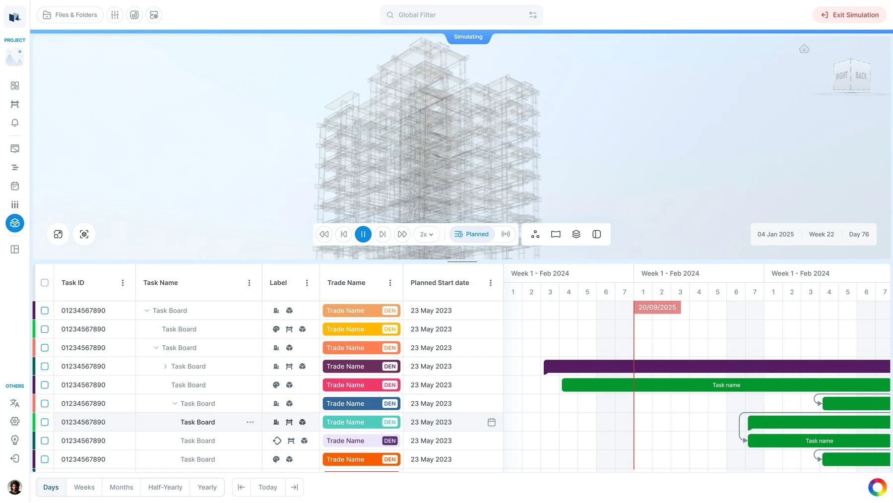
The decision. Make the right side of the split view real, and put the existing Gantt in it. One piece of work closes both problems, and 4D turns from a demo into a tool a planner can use.
Decision 5: show the mode on the screen
Click a part of the model and you see its linked tasks. Turn on the Properties tool first, click the same part, and you see its file properties instead. Nothing on screen tells you which one you will get. It depends on a tool state you cannot see.
That is the colour problem again. The product keeps putting meaning into a mode, and then hides the mode. Once I saw it twice, it stopped being two bugs and became one thing to fix: one strip on the screen that always names the active mode.
The other findings, in short
Save buttons that do not save. Saved filters, notes and markups all have a Save button. The server side was never built, so the data is lost on refresh. My advice was simple: connect it, or remove the Save buttons until you do. Losing data quietly is worse than a missing feature.
Linking one part at a time. Box selection already exists, and the server already handles repeat links safely. Linking 42 parts to a task should be one action. Today it is 42.
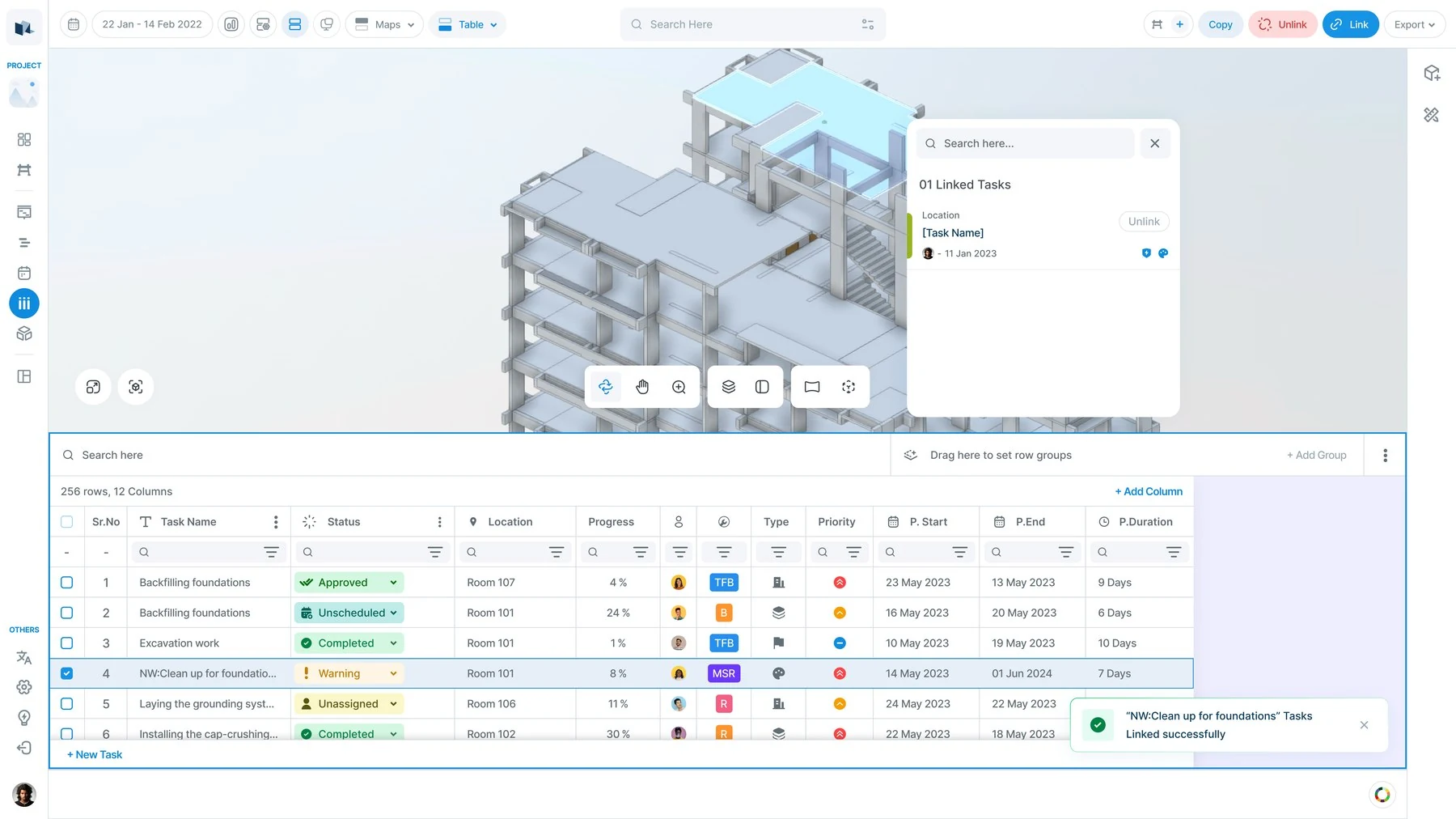
Each mode rebuilds the toolbar. Section and Measure each swap in their own toolbar, and each one copies the same navigation buttons again. So one change to navigation has to be made in three places. One toolbar with a small group for the mode fixes this.
A developer label on screen. One clipping tool is labelled Bim.Add X Plane. The tools next to it
say "Add Box". Small, but it tells a user how carefully the rest was checked.
Engineering settings for site managers. The view settings ask a site manager to turn off shadows or switch on "large model experience". The product should choose these from the file, with an override for people who want one.
Compare versions by pasting a file ID. The version history is already in the system. Two dropdowns can replace an ID field nobody can fill in from memory.
Why it is not built on Autodesk
This is the first question people in construction ask. The viewer reads the open building file format (IFC) in the browser and draws it with Three.js. There is no Autodesk Forge inside.
What that gives: no cost per user, so subcontractors can see the model too. Full control of the drawing, which is what lets the product change the colour of single parts at run time. And the data comes straight from the file.
What it costs: files from Revit and DWG must be converted first, and that converter does not exist yet. A folder in the menu is named "BIM 360". It is just a folder name, not a link to Autodesk. A case study that only shows the good side of a decision is marketing, so that is the bad side.
Against other tools: Autodesk Build and Procore also link models to schedules. They are heavier, priced per user, and they open Revit files directly, which is a real advantage. Where this product is stronger is the loop between the model and the plan: here the model is where you read the schedule, not a file you open to check one thing.
Where the product could go next
BIM tools are often sold by "dimensions". Only the first three are clear.
3D, 4D and 5D mean the same to everyone. After that, every vendor means something different. So the useful question is not "which number next?" It is "which feature next?"
Cost (5D) is closest. Cost fails in most viewers because a part is not linked to a task, so there is nothing to put a price on. Here that link already exists. The design work is honesty: a cost from a badly built model is wrong, so the product must show which parts it measured, which it guessed, and which it could not read.
Handover is next. At the end of a project, someone builds a list of what was installed, where, and by whom, by hand, from spreadsheets. VisiLean already holds checklists, approvals, snags and progress against the model. Most of that list already exists.
Progress that updates itself is the big one. The platform already reads site cameras and already compares planned against actual. Today a person types progress in, and every other feature depends on that typing. The rule from the Evercam work applies here too: the system suggests, a person decides.
Which AI features construction companies really use, and which are still demos, has its own post.
What I would do next
- Ship the "no data" colour first. One value, the biggest visible change, and it makes every other colour problem easier to see.
- Then the Gantt in the split view. It closes three of the top findings in one piece of work.
- Then show the active mode on screen. Both headline problems come from a hidden mode.
- Then watch someone use a project with twelve trades. Every legend was designed for a few trades. Real projects have many more, and I have not seen the legends under that load. That is the part I am least sure about.