The site board that is the schedule
Every big construction site plans its day in front of a wall of drawings, magnets and marker pen. Then someone types it all into the planning system again. I designed a board where the shape you draw and the task in the schedule are one record.
- VisiLean
- Product design, interaction design, prototype and spec (sole designer)
- With a product owner, engineers and QA
- Prototype deployed for review
- 1 March 2026
- 15 min
07:15, on every large construction site. The team stands in front of a wall in the site cabin: a big printed drawing on a magnetic board, magnets showing who works where, a hand-drawn safety table, printed delivery sheets. They agree the day, and walk out.
It works. That is the important part, and it is why most software built to replace it has failed.
The problem: every decision is made twice
The meeting makes its decisions in marker pen on the wall. Afterwards, someone types the same decisions into the planning system. By the time anyone compares the two, they disagree.
And when they disagree, the crews trust the wall. It is the thing they stood in front of.
What management pays for
No history
Boards are wiped daily, so after an incident there is no record
Only visible in the cabin
The field, the office and the client cannot see today's plan
Connected to nothing
It does not talk to permits, deliveries or the schedule
What the daily user feels
Badge logistics
Every new subcontractor means printing and laminating magnets
Reprinting
Every drawing revision means another A0 sheet
Everything typed twice
Weather by hand, deliveries pinned, attendance nobody can read
That split became the plan: sell the record upward, win the daily user with speed.
Why the wall is hard to beat
Before designing the replacement, I wrote down why the wall wins. "It's paper, so it's worse" is the idea that kills construction software.
- You see the whole day in one look. No clicks.
- It is fast. Moving a magnet takes five seconds.
- It never logs out, never loads, and never needs the wifi.
- It brings people together. The meeting happens because the wall is there.
So I put one line at the top of the product plan, and used it to say no to about a third of the feature requests that came later:
"The digital product has to be faster than magnets, not a more complete CAD tool."
Who it is for
Five kinds of people use the board, and only one of them really edits it. The site manager sets it up and runs the meeting. The planner, the trade foremen, the safety lead and the client mostly read it.
That changed the whole product. It is not a drawing tool with a viewer added. It is a board people read, with an editing mode for the one person who sets it up.
My part
I was the only designer, working with a product owner, engineers and QA. I did the research, the interaction design, the design system, the prototype and the tickets. Product and engineering decisions were made together with the product owner and the team.
There was no budget for a formal study, and a production version was already being built. So I used cheap inputs and said where each one stopped:
- Photos of a real board wall on a live data-centre project. It gave me the words site people already use: laydown, exclusion, muster.
- The existing production build. So tickets could honestly say "redesign" instead of pretending everything was new.
- A competitor check of Procore, Autodesk Build, Bluebeam, Miro and others, from their public material.
- How Figma shows notes on a zoomable canvas. This became the model for the hardest problem in the product (Decision 4).
A morning with the board
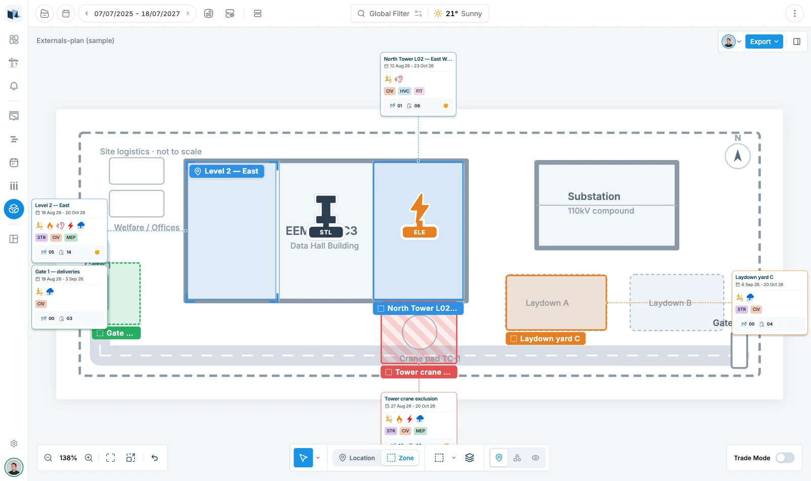
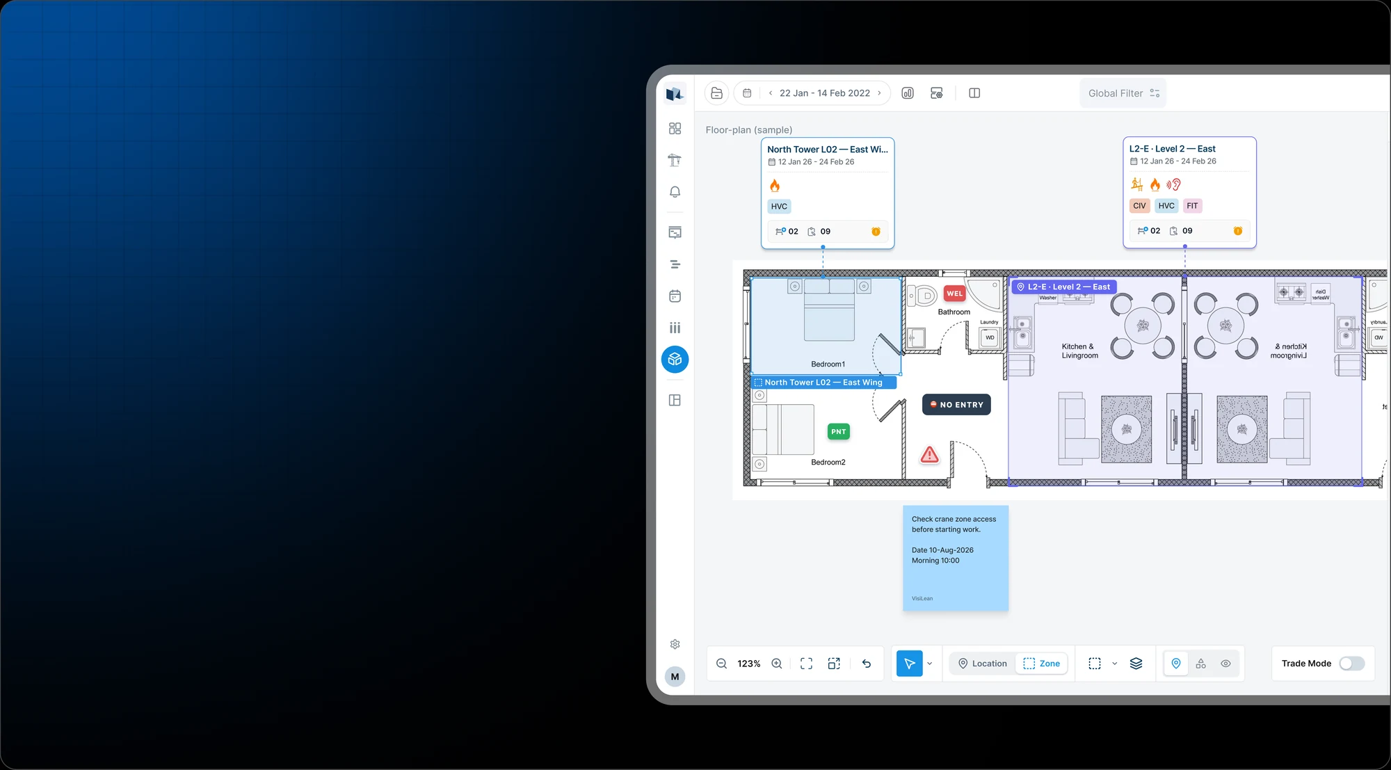
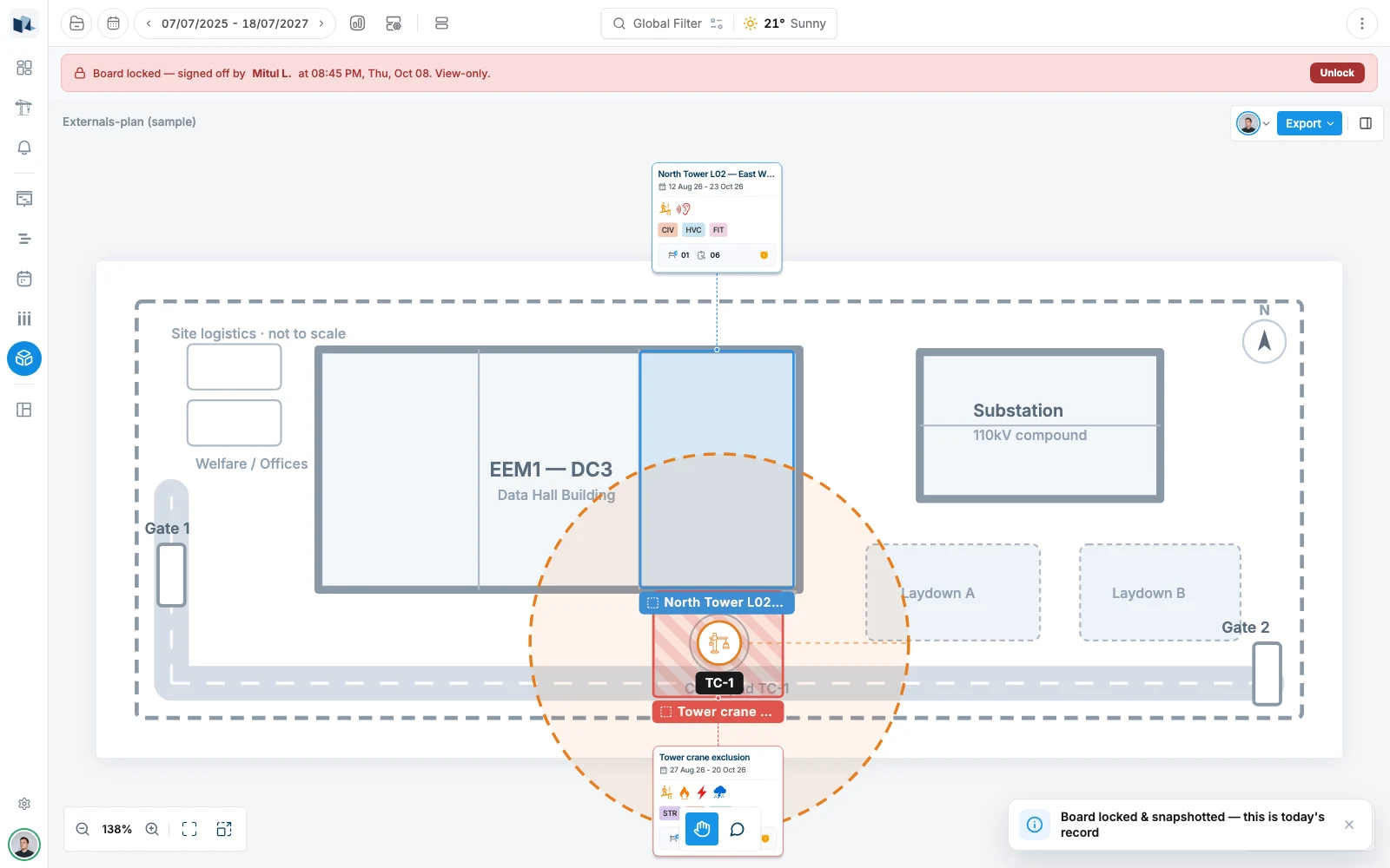
07:00. The site manager opens the board. The site plan is already loaded. She draws a box around Level 2, East. The moment she lets go, a dialog asks which location in the schedule this is. She picks it from the list.
A card appears beside the drawing. It shows the area's dates, its high-risk work, the trades on it, and how many tasks and constraints it has. She did not type any of that. It comes from the schedule.
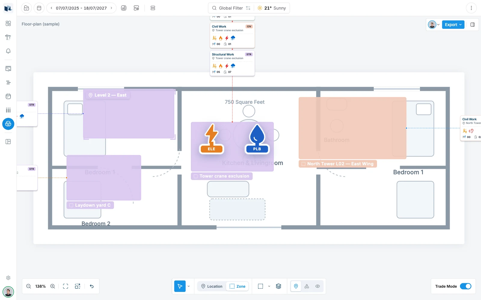
She turns on Trade Mode. Each area splits into one card per trade, and the area cycles through its trades' colours. It answers "who is working where" at a glance, the question the magnets answered best.
07:15. The meeting. A foreman taps the scaffold area and leaves a comment: "Scaffold access blocked here until 10:00." He can only read the board, but anyone can comment, because a foreman flagging a blocked route is the most useful comment on the board.
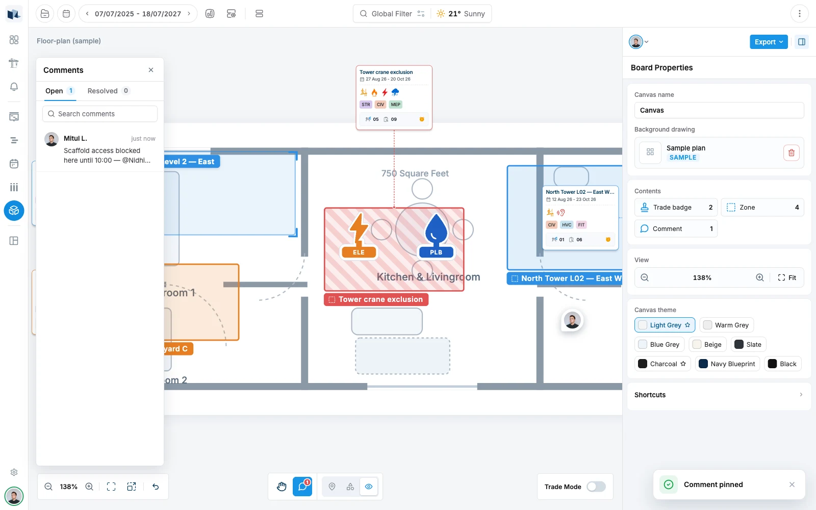
She right-clicks the area and creates a task for the work they just agreed. The area is filled in for her and locked, because changing it would quietly separate the task from the shape it came from.
07:30. She locks and signs off the board. The board becomes read-only, and a snapshot is saved. This is the record the wall never had: what the board said on this morning.
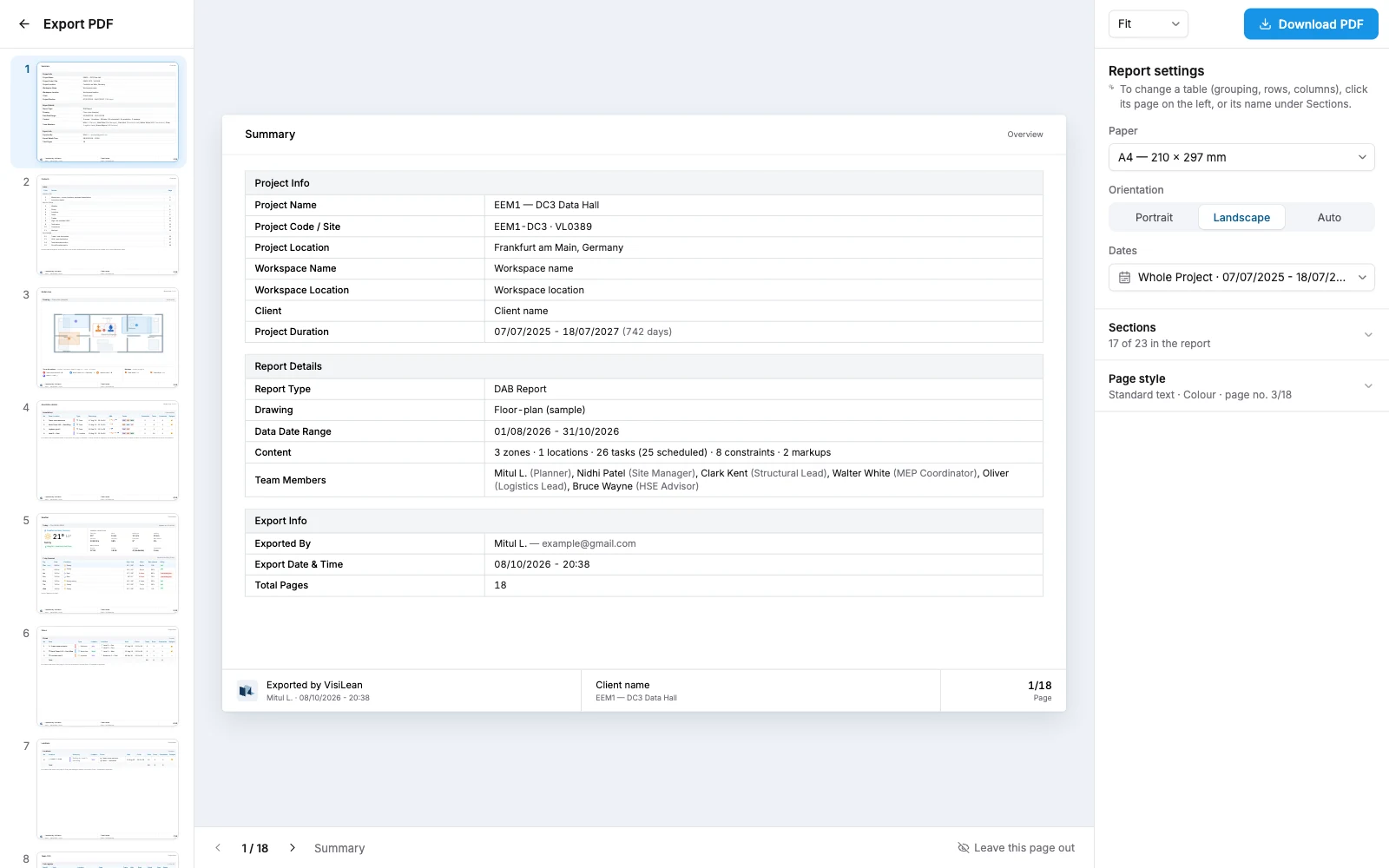
Then she exports the day's report. One PDF with the drawing, every area, the tasks, trades, high-risk work, constraints and the weather. A site can print it and file it.
VisiLean SiteBoard, web prototype
Open in a new tab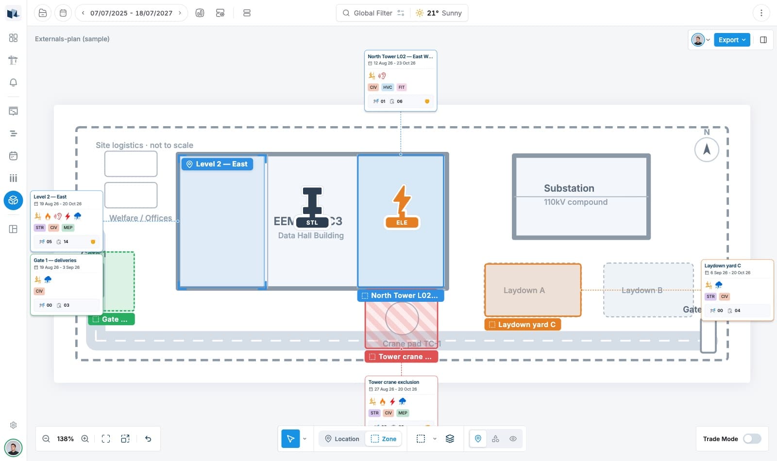
Decision 1: the shape and the schedule are one record
This is the decision the whole product rests on.
Before. The simple way says: a shape on a drawing has a name and some task data attached. That breaks as soon as real drawings arrive, because one location can appear in more than one place. "Level 2, West" might be three shapes on two different sheets. It is still one location, and one row in the schedule.
The decision. Keep the shape and the identity apart. Shapes live on drawings. The identity lives in one list, and the schedule points at that list.
First shape on plan A
Level 2 sheet
Second shape on plan A
Level 2 sheet
Shape on section C
A different sheet
One registry entry
Level 2, West
12 tasks, 2 constraints
Takt board
Gantt chart
Task table
The result. Draw an area, link it to the schedule, and the board stops being a picture of the plan. It becomes a way into the plan. Change it in any view, and every other view already agrees, because there is only one record underneath.
Decision 2: a location must be linked, a zone can wait
The board has two kinds of area that look the same on a drawing:
- A location is part of the building plan, like "Level 2, West". It owns tasks.
- A zone is for today, like "crane exclusion" or "deliveries". It may only exist this week.
The rule. A zone can be skipped. An exclusion area drawn in a hurry at 07:10 is useful even if nobody links it. A location can not be skipped. An unlinked location never appears in the schedule, and quietly collecting those is how a plan goes wrong. So if you close the link dialog for a location, the shape is removed, and the dialog tells you that before you get there.
Two more rules came from this:
- A zone lives on one shape. A location can live on many, because one location really can appear on several sheets.
- Only the lowest level of the list can be linked. You can open "Building A" to find things, but you can only pick "Level 2, West". A task needs a real place, not a whole building.
Decision 3: three modes, and nothing disappears
The problem. The board has three different jobs. Plan the areas. Mark up the day with stickers, notes and crane circles. And simply be read. Put every tool in one toolbar and you get dozens of icons nobody on site will learn. Put each job on its own screen and you break the one-board idea that makes the wall work.
The decision. One board, three modes: Zone and Location, Markup, and View only. Each mode shows only its own tools, and only its own things can be selected.
The detail that matters: everything else stays visible. The production build hid the other modes' content when you switched. I kept it on screen but locked, so you never lose the context you are marking up because of. The product owner agreed to keep it that way.
The same key does the right thing in each mode: Z draws a zone in Zone mode, R draws a rectangle in Markup.
Decision 4: cards that live on the drawing
This was the hardest problem in the product, and the one I got wrong the most times.
The problem. Each area needs a small card on the drawing with its dates, risks, trades and counts. About 150 pixels wide. Then the limits arrive:
- The drawing zooms from 2% to 2500%, more than a thousand times.
- A floor plan can have thirty or more areas, some of them small.
- The cards must never cover the drawing, because the drawing is what people are discussing.
- They must be readable on a wall screen, from across the room.
What I tried, in order. The build log has thirteen layout passes. In plain words:
| Pass | What I tried | What happened |
|---|---|---|
| 1 | Card above each shape, growing and shrinking with zoom | Too small to read zoomed out, huge zoomed in |
| 2 | Cards in the top and bottom margins, like Figma's notes | Every card piled onto two edges |
| 3 | Push colliding cards to the right | Replaced later by the four-side rule |
| 4 | Below 70% zoom, turn cards into small pins | Removed again in pass 6 |
| 5 | Rebuilt after reading how Figma Dev Mode handles zoom: same size on screen at every zoom | The rule that stayed |
| 6 | Remove the pins. The card is always full | Kept |
| 7 | Below 30% zoom, let cards shrink with the drawing | Kept. A tiny drawing with giant cards made no sense |
| 8 | Tune the card size three times | Kept at the third value |
| 9 | Keep cards inside the drawing's width. The selected card comes to the front instead of hiding | Kept. An earlier version hid it, just when people were talking about it |
| 10 | Each card goes to the nearest of the four edges | Kept |
| 11 | Pack all cards at once to stop overlaps | Overlaps fixed, but cards ended up far from their shapes. Reverted |
| 12 | Move a card only if it collides, as little as possible | Kept |
| 13 | On a PDF with several pages, lay out each page on its own | Kept. Cards never jump between sheets |
The result. Three rules together: put each card on the nearest side, move it only as much as needed to stop overlaps, and keep it the same size on screen until 30% zoom. Every rule is in the ticket with its numbers, so engineering builds the same thing.
Designing for a touchscreen in a site cabin
The main screen is a large touchscreen on a cabin wall, used standing up, maybe with gloves. That breaks a lot of normal desktop design. There is no hover, no right-click, and no precise pointer.
What I changed in the prototype:
- Two fingers tap to open the menu. An earlier version used a long press. Long press now starts a multi-select instead.
- On-screen Undo and Done buttons, because there is no keyboard on a wall.
- Pinch zooms the drawing, not the page. The browser's own zoom is switched off on the board.
- The first tap can never delete. On file rows, the first tap shows the actions, and only the second tap acts. Delete still asks to confirm.
The honest gap. The tickets set 44 pixels as the smallest touch target. The prototype's controls are still 30 to 40 pixels. That is the first thing to fix before anyone tests it on a real wall.
Smaller decisions
- Export templates removed. I added a template picker to the export, then took it out: picking a template quietly wiped the settings you had already changed.
- Export kept simple. A second, more powerful export design was dropped. My note at the time: "too much cognitive load, I want very simple".
- Two kinds of duplicate. "Duplicate with task" copies the shape and its link, for the same place drawn again. "Duplicate with shape" copies only the outline and asks you to link it, for a different place with the same footprint.
- Comments for everyone. Comments used to be admin-only. Now anyone can post, reply and resolve. Only admins can delete. The rare permission is deleting, not taking part.
How it was built: AI wrote the code, I made the decisions
A canvas product is defined by what happens while things move: what a card does at 27% zoom, what a second finger does halfway through a drag. Static screens cannot show that. So instead of a Figma file, I kept one working prototype as the spec, a single file of about 19,000 lines, and every ticket points at it:
"If the ticket and the prototype disagree, the prototype wins."
I built the prototype with Claude Code. I set every behaviour and rule, and it wrote the code and the browser checks. The decisions in this study are mine. The build log records them, for example:
- "Per the user: a zone must live on exactly ONE shape."
- "The user chose to remove templates."
- "User picked 'unified 3-zone' from 3 options."
The AI made each change, checked it in a real browser, and updated the affected tickets in the same pass, so the written spec did not drift from the working one.
78 tickets in 10 groups came out of it. At one point engineers said they were blocked by requirements that belonged to other tickets. I moved 87 of them to the ticket that actually owned them, across 33 tickets, and deleted none. Each one left a note saying where it went.
Where it stands
The prototype is deployed for review and opens in a browser with nothing to install. A readiness review on 29 September said: move this into the production viewer, do not ship the prototype itself.
There are no site numbers here, because no site has run its morning on it yet. When one has, they belong here and nowhere else.
What has not been proven
Every claim about the meeting comes from watching the physical wall, not from watching this replace it.
The riskiest idea is that a screen can hold a room's attention the way a wall does. A wall has no login, never crashes, and works without wifi. That is a high bar, and a prototype cannot clear it.
The schedule data on the board is still sample data, and collaboration only works between tabs on one device.
Where the board goes next
Already there: lock and sign off, a saved snapshot of each morning, board history, saved board reports you can reopen, and a dated PDF with a sign-off block and "changes since last report". The "board as a record" idea is now real.
Not yet:
- Work that can happen in parallel. Today the order is "this, then that". Real sites also say "these two in any order, both before the third".
- A link to the 3D model. An area on the plan and a part of the model describe the same piece of building, and they do not know about each other yet.
- Areas the board suggests. A drawing already has rooms and grid lines. The board could suggest areas, and a person would accept or change them. It saves setup work without taking any decision.
- Real offline use and real-time teamwork across devices. A morning that fails because the wifi did is a morning that goes back to the wall, for good.
What I would not build: a board that reschedules itself overnight. The value of the meeting is that people agree in front of it. A system that moves the plan on its own removes the agreeing.
What I would do differently
Read how others solve the mechanics, early. Figma's notes were my reference from pass 2, but I only read how Dev Mode really handles zoom at pass 5. The fixed-size rule came straight from it. Now I read the mechanics first, not just look at the result.
Design for the reader before the editor. Four of the five kinds of user only read the board. The modes and tools got my early attention. The cards, which everyone else reads, came later and needed the most work.
Fix touch sizes before anything else. The rules were in the tickets from the start, and the prototype still does not meet them.
Do not be the only person who can change the spec. Owning both the design and the prototype made changes cheap and the spec clear. It also means the source of truth lives with one person.