One platform, sold as three products
VisiLean had grown into three products that still navigated like one, so no module could be used or sold on its own. I redesigned the navigation so each module stands alone and opens in its own tab.
- VisiLean
- Product design, information architecture
- 4 January 2026
- 6 min
VisiLean had grown from one product into three: Production for tracking work on site, Planner for scheduling it, and Quality for inspections. The navigation had not caught up. It still behaved like one product with extra pages, which meant nobody could use just the part they needed.
People should pick a product because they need it, not because the menu made the choice for them.
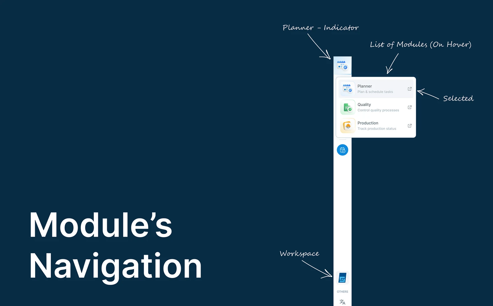
Three products, navigated like one
The three modules do genuinely different jobs. Production tracks what is happening on site. Planner handles the schedule. Quality covers inspections and checklists.
But the navigation still treated them as sections of one thing rather than three products.
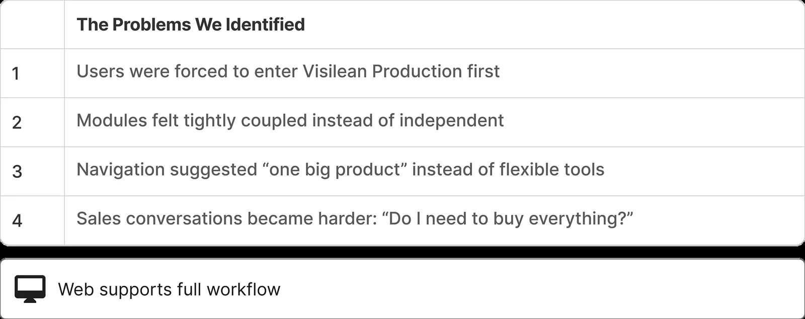
That hurt twice. People got confused about how to reach the part they wanted, and the company could not sell one module on its own, because using it meant taking the whole platform.
Move between products, not pages
The fix was to stop thinking of navigation as moving between pages, and start thinking of it as moving between products. Google Workspace and Microsoft 365 already work this way: Docs, Sheets and Drive are one family, but each is its own thing.
So the question became simple:
What if each module behaved like its own product, but stayed connected to the others?
Four rules the design had to follow
- Feel familiar by default. Nothing about the existing habit should break.
- Reach any module directly. No module should be reachable only through another.
- Never lose what you were doing. Switching cannot cost you your place.
- Leave room for the next one. A fourth module should slot in without a redesign.
One switcher, three products
A module switcher, where:
- You still land in Production, as before
- Planner and Quality are one click from anywhere
- Each module opens in its own browser tab
- No module needs any of the others to work
You buy and use only the part you need.
Moving between modules
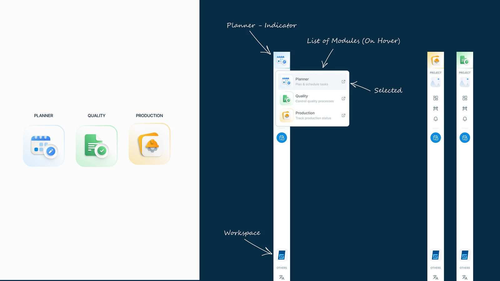
From anywhere, the icon at the top of the sidebar opens the switcher, so someone in Planner can jump straight to Quality.
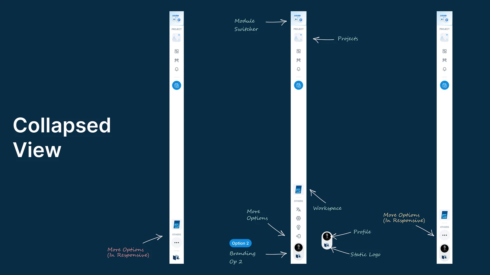
With the sidebar collapsed, the switcher is still the first thing at the top. Nothing has to be expanded to change product.
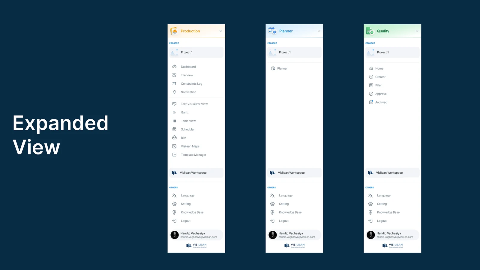
Each module has its own header colour and only its own menu, so Quality is not a Production menu with extra sections bolted on.
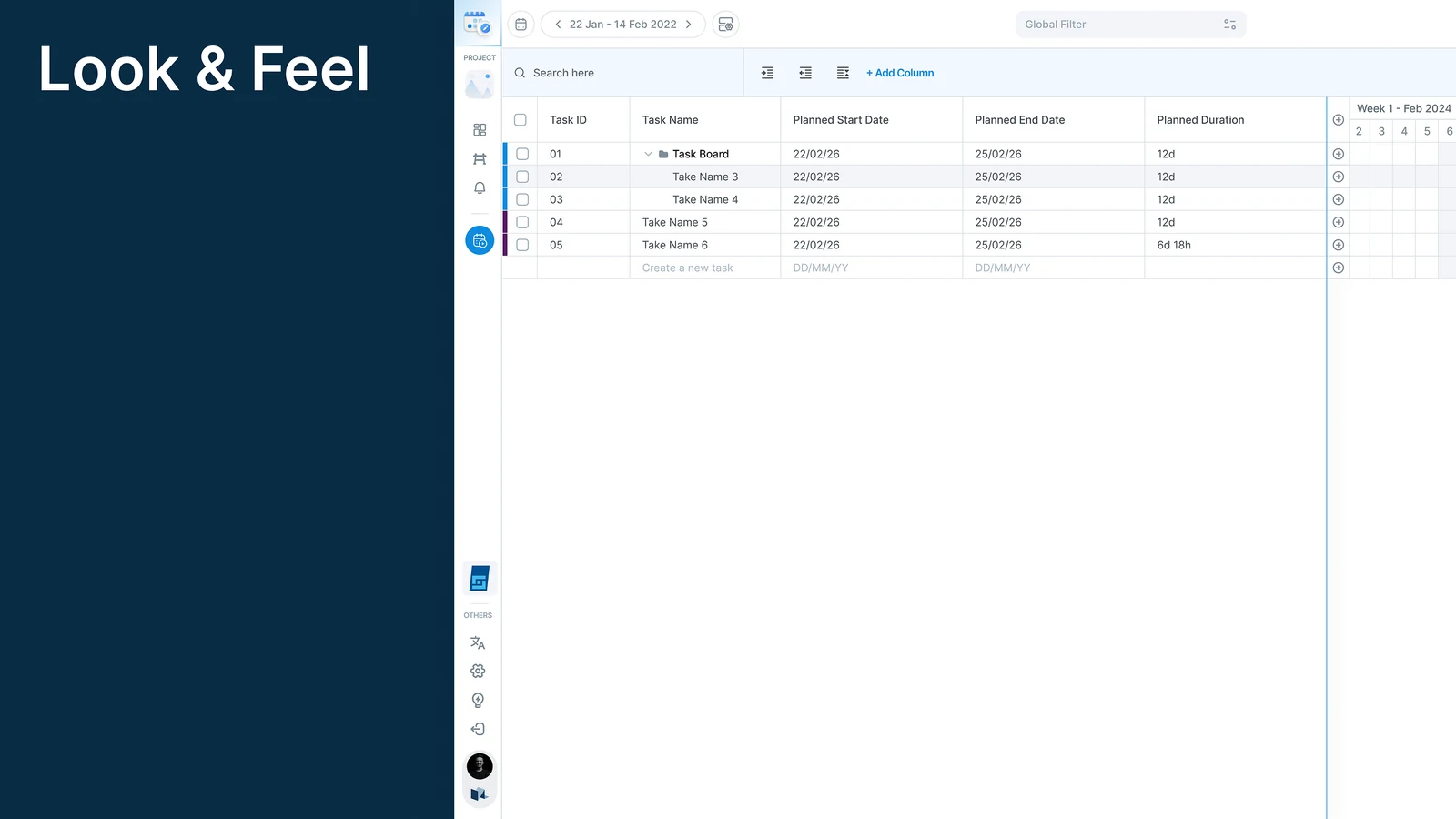
Planner opens in its own tab. Production stays where it was, untouched, in the tab next to it.
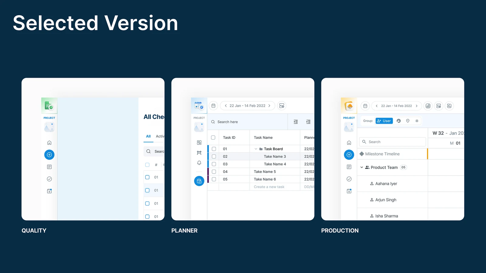
Moving between tabs, the icon and its colour say which product you are in before you read a word.
Why a new tab, and not the same one
This was the decision that mattered most.
Switching in the same tab means you lose whatever you were looking at, you risk unsaved work, and it gets genuinely confusing when you are moving between two roles.
So each module opens in a new tab.
That gives you two jobs side by side, makes checking one against the other quick, and means the back button does what the browser has always done. It matches how people already work with several tabs open.
Three alternatives that lost
One app, with features hidden by permission. The cheapest option. It keeps the all-or-nothing feel, because a customer who bought one module still sees a product mostly full of things they cannot open. Locked doors are worse than no doors.
Three separate apps with three logins. Genuinely modular, and miserable. Anyone who bought two modules now signs in twice and manages two sets of users.
A launcher page you pass through. A menu screen listing the three products. It adds a step to every switch, and the step is pure overhead once you know where you are going.
The switcher won because it is the only one of the four where buying one module and buying three both feel correct.
Why the reference was Google Workspace, not Procore
Procore and Autodesk Build are both sold as platforms with modules, and both largely keep the single product shell. Google Workspace and Microsoft 365 are the better reference, which is why I used them: Docs and Sheets are unmistakably one family and unmistakably separate products, and nobody finds that confusing.
The construction tools have the harder version of this problem, because their modules genuinely are bought separately and by different people.
What was in scope, and what was not
In: the switcher, how the three modules relate, what opens where, and keeping context when you move.
Out: billing, provisioning and licence management. Navigation can make separate modules feel like separate products. It cannot make them separately purchasable on its own, and that half of the problem sat with the commercial side.
What it meant for the business
This was as much a product decision as a design one.
Before, the platform was all or nothing, which made a single module hard to sell.
After, each module stands on its own. Planner or Quality can be sold by itself, and a customer can add more later without being forced into everything at once.
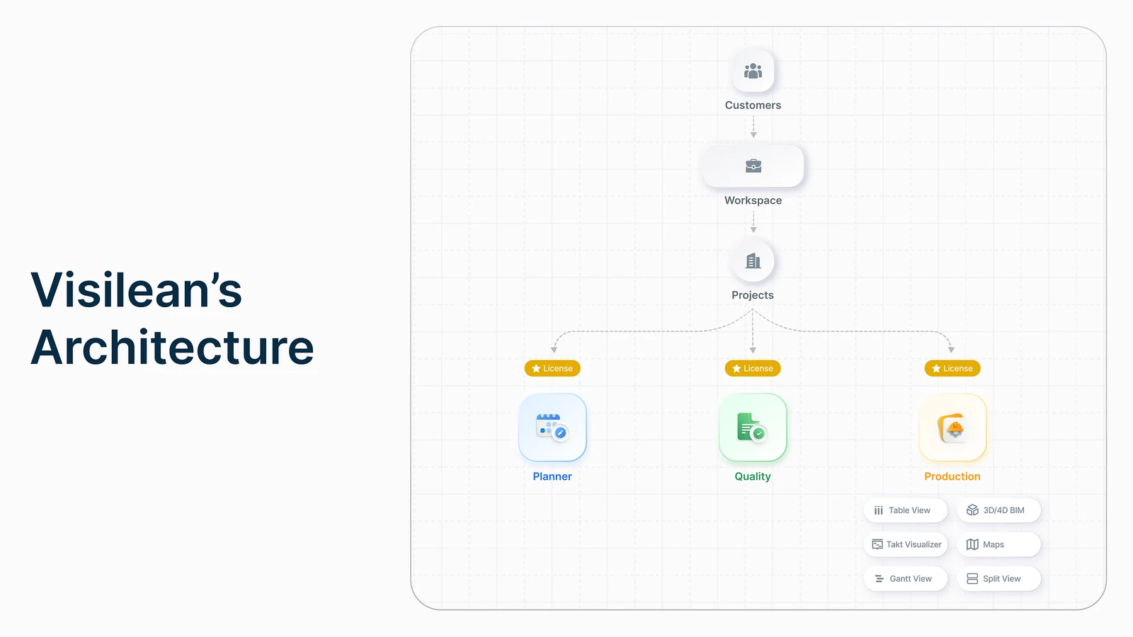
The navigation is what made selling modules separately possible.
What changed for people using it
For existing users
- Faster access to the right tool
- The workflow is never interrupted
- Tasks stay mentally separate
For new customers
- No pressure to adopt the whole platform
- Onboarding into a single module is easier
- The value of the product is clearer
What I would do next
Check whether modules actually get sold separately. The navigation was the design half of a commercial argument. If a year later everyone is still buying the whole platform, the navigation was not the constraint and I read the problem wrong.
Watch what happens at the fourth module. The design was built to take one. The first real test of "scales for future modules" is the first module I did not design for.