Where did my Telegram download go?
A two week study of one problem in Telegram on Android. You download a file, and then you cannot find where it went. Heuristic review, two ideas, a paper prototype, a redesign and usability testing.
- Self-directed
- UX research, heuristic evaluation, UI design
- 5 May 2024
- 5 min
It started with something a user said:
"I just downloads one file and after i many time finding a where is downloads file"
That got me thinking. If it is this hard to work out where the categories are, it is not only a problem for the person using it. It affects the business too.

The heuristic it breaks
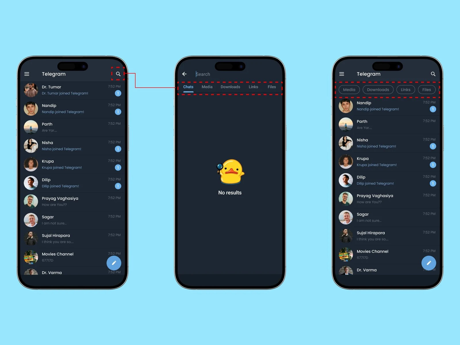
The principle: flexibility and efficiency of use.
The problem I found: I use Telegram a lot for downloading movies and similar things. Afterwards I often struggle to find those files again. That is when I realised it was working against both flexibility and efficiency of use.
Two ideas
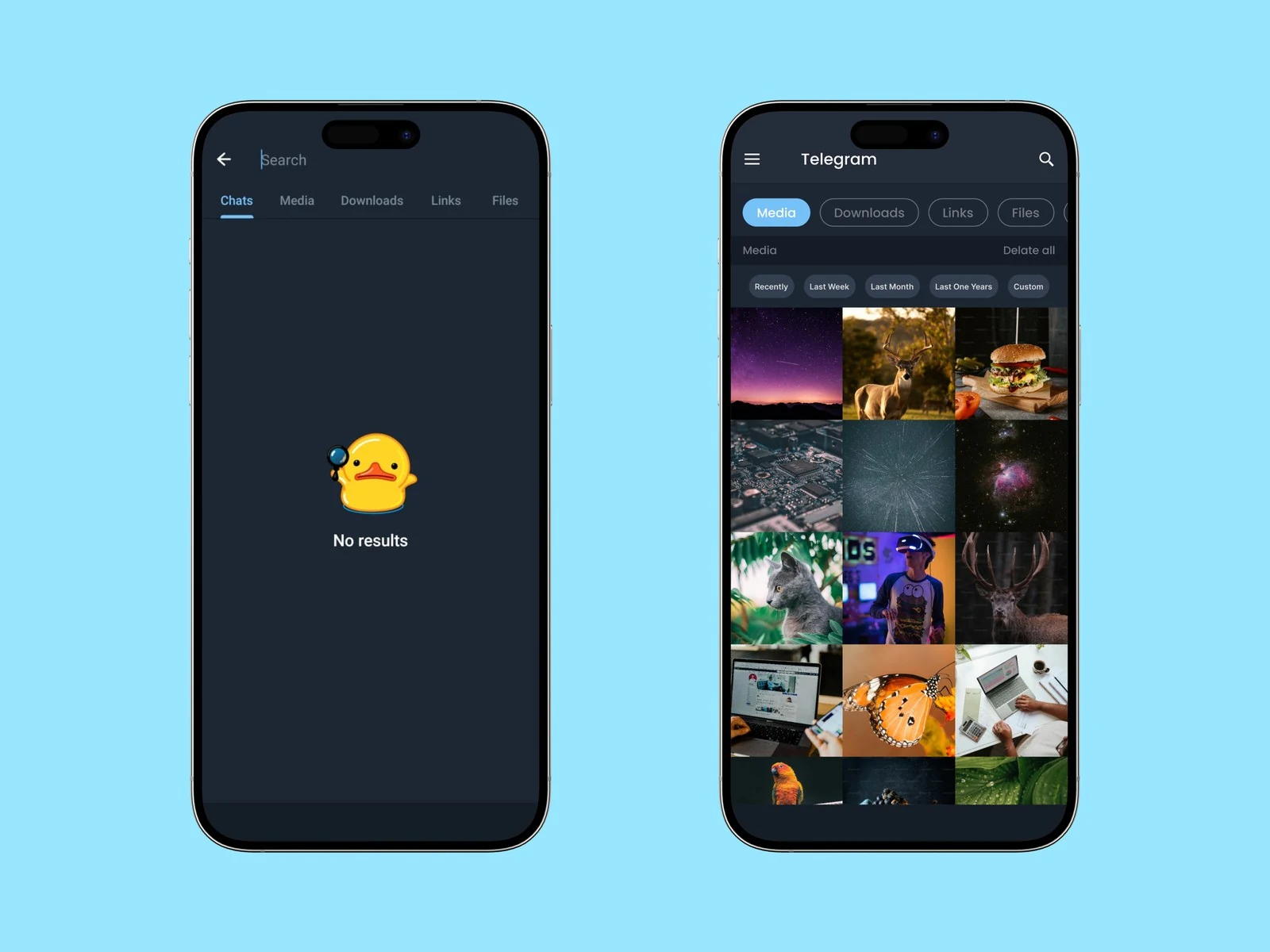
Idea 1. Show all the categories along the top, so people can pick one straight away.
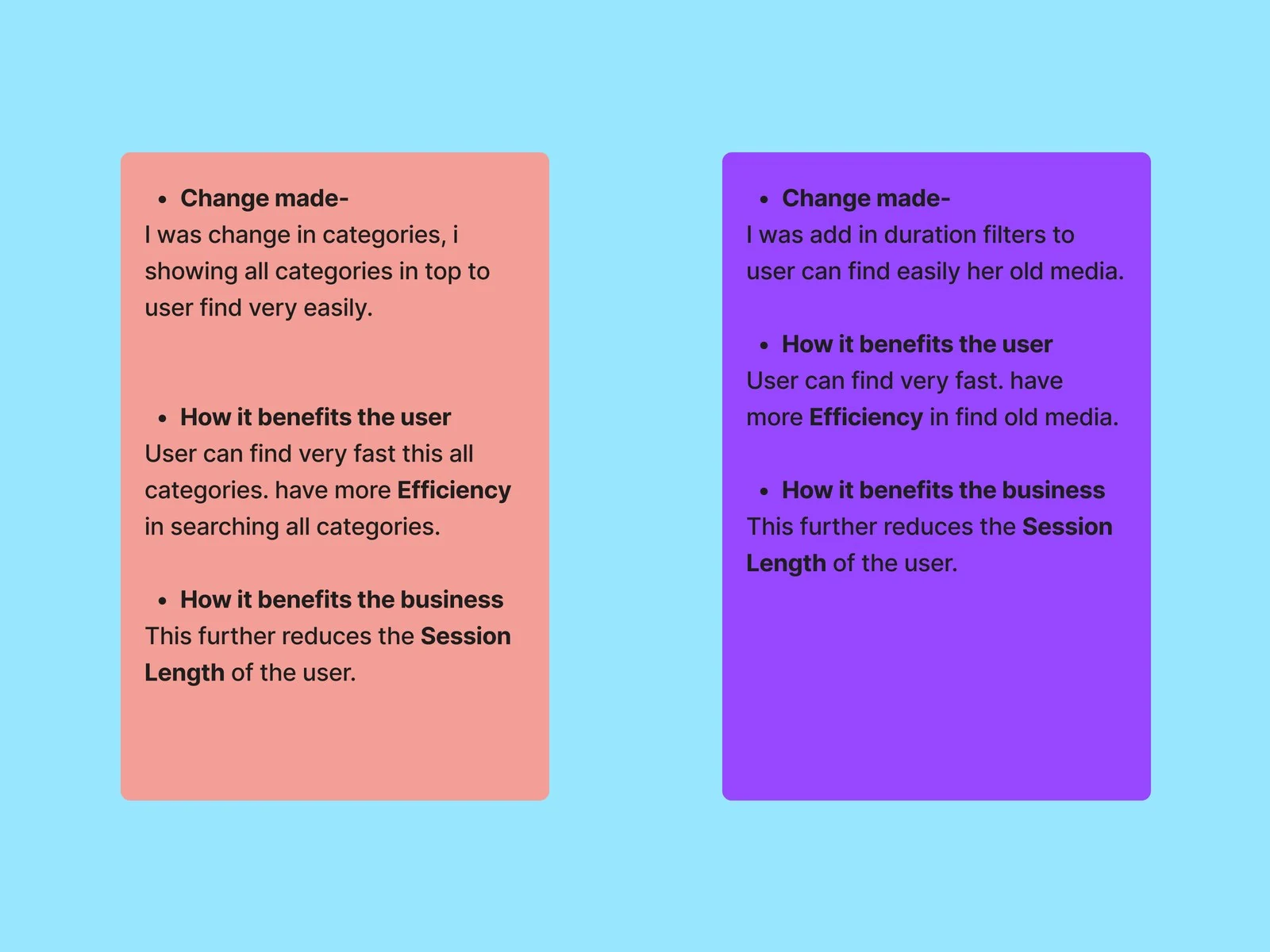
Idea 2. Add a sort and filter option in the media view, so you can narrow by duration and find the right thing faster.
A paper prototype
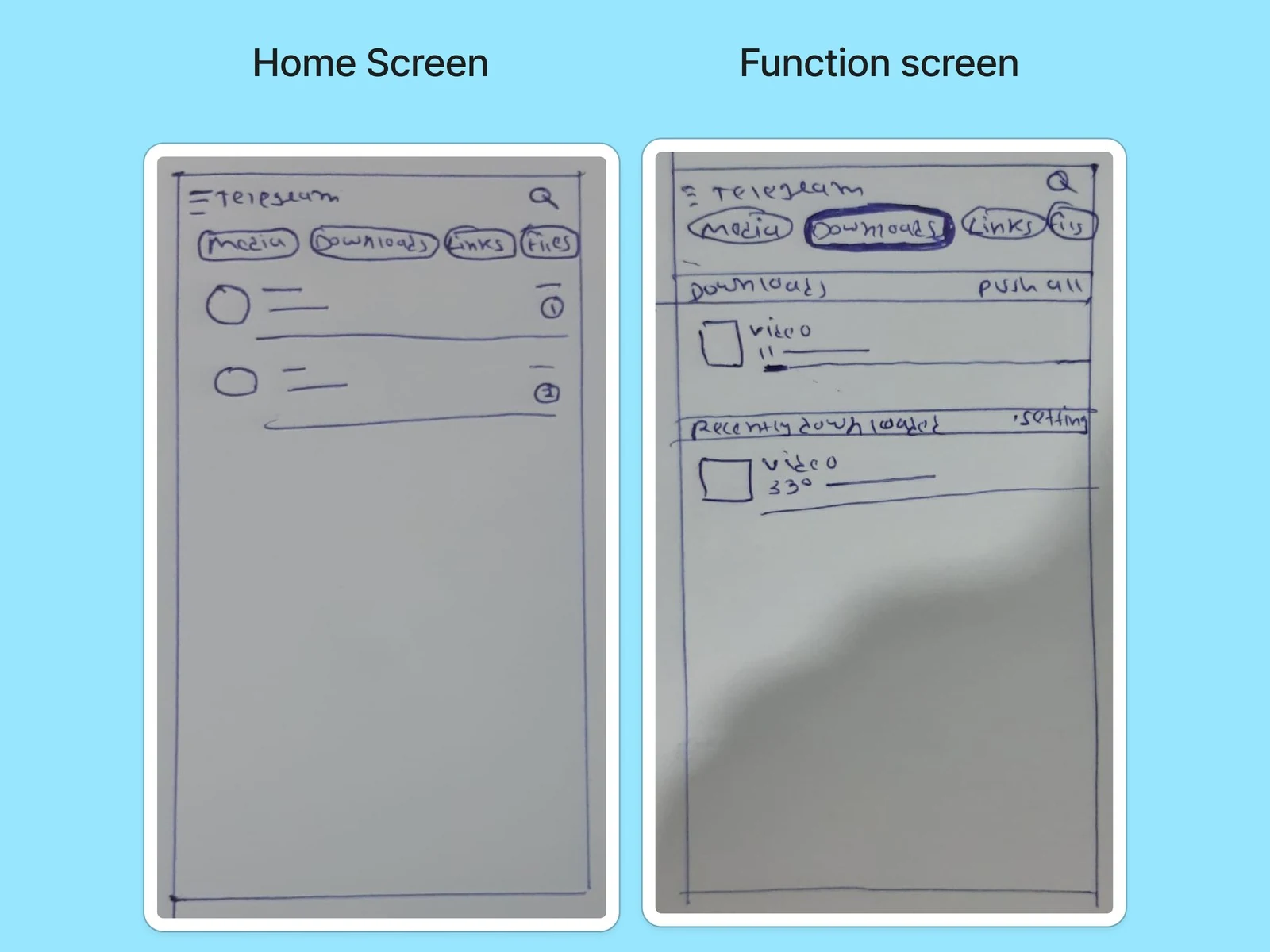
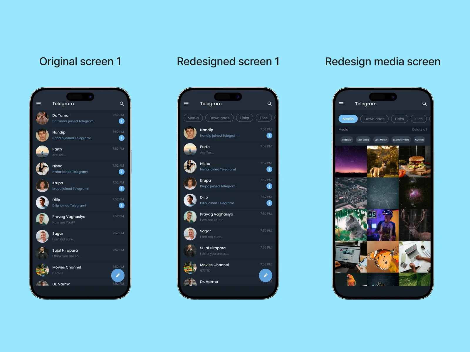
Categories on the home screen
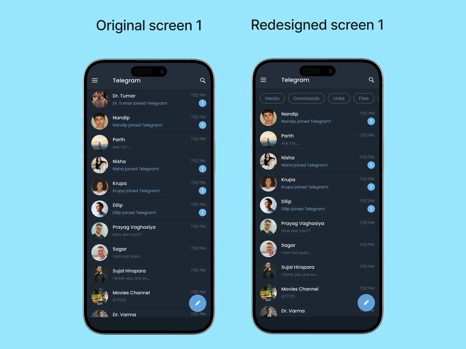
What changed. I added categories to the top bar on the home screen: Media, Downloads, Files, Audio and so on. That lets people sort what they are looking for quickly.
What it gives the user. You no longer have to go to the search bar to find these categories, and the filter makes searching faster.
What it gives the business. The feature should cut the time people spend searching, which shortens the session length spent looking for something.
Usability testing
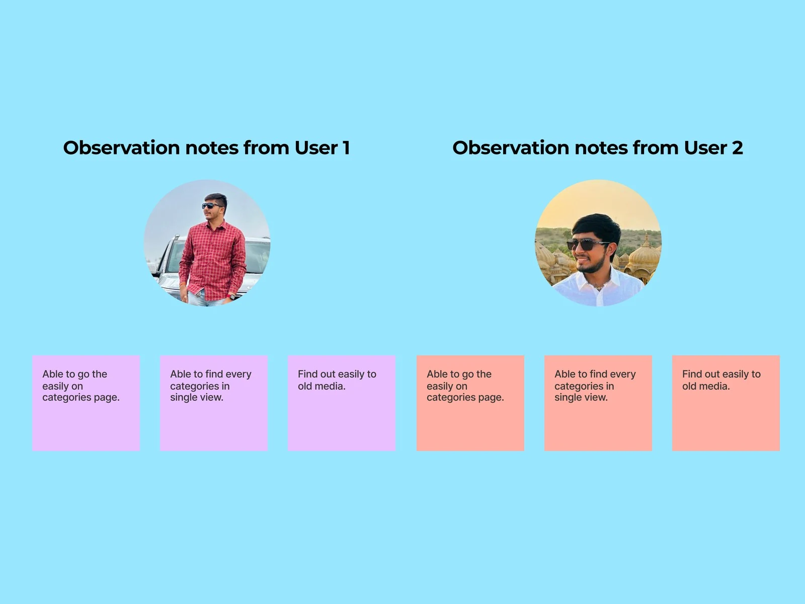
Tasks I gave people:
- Can you find your downloaded file?
- Can you reach a particular piece of media by date?
- Can you find the home button?
What I watched for:
- Does the person understand the categories?
- Does the person understand where downloaded files actually are?
- Can the person find older media quickly?
The final changes
What else I considered
Leave it in the menu and make the menu better. The categories already live behind the hamburger. Reorganising that menu keeps the fix cheap, and it does not help, because the problem is not that the menu is badly ordered. It is that people do not think to open it.
A filter sheet from the bottom. More room for options, and it costs a tap before you see anything. The whole point was to remove steps between wanting a file and seeing it.
Search only, made more prominent. Search already exists and already works. It requires knowing what you are looking for. Somebody hunting a film they downloaded last week does not have a search term, they have a rough idea and a date.
The cost. The chips take a row at the top of the chat list, and that row pushes conversations down. On a screen whose main job is showing conversations, that is a real price, and it is only worth paying because the row is also the answer to "where did my download go".
What the other apps do
WhatsApp and Signal have no category concept at all, because they are not really used as file stores. Telegram is, which is why this problem exists here and not there.
Telegram already had the pieces. There is a Downloads view, and there is media filtering inside a chat. Both are buried, and neither is on the screen people actually start from. So this was less about inventing a feature and more about moving one that already existed to where it would be found.
What I would do differently
Test with real accounts, not clean ones. I tested the idea with a tidy demo account. The person this is for has years of chats and hundreds of files, and that is exactly the condition that makes the categories useful and the screen crowded. A clean account cannot show either.
Check whether the chips get used or ignored. The honest risk is that people learn to scroll past a row of chips the way they learn to ignore a banner. That would be visible quickly in a test and would not be visible at all in a mockup.
Two weeks is the real limit here. This was a self-directed exercise with no access to Telegram's data, so everything above is reasoning from one person's problem rather than evidence from many. I would rather say that than imply research I did not do.
What this study is, and is not
A two week, self-directed exercise with no access to Telegram's data. I do not know how many people hit this problem, how often, or what the team has already tried and rejected.
What it rests on is one clearly stated user problem, a heuristic review that names the principle being broken, and a change that can be checked against how the app already behaves. That is the honest ceiling of a study done from the outside, and it is worth saying rather than implying research that did not happen.